
Popped from the Page
Visual identity, illustration, animation, incidental design, environmental design
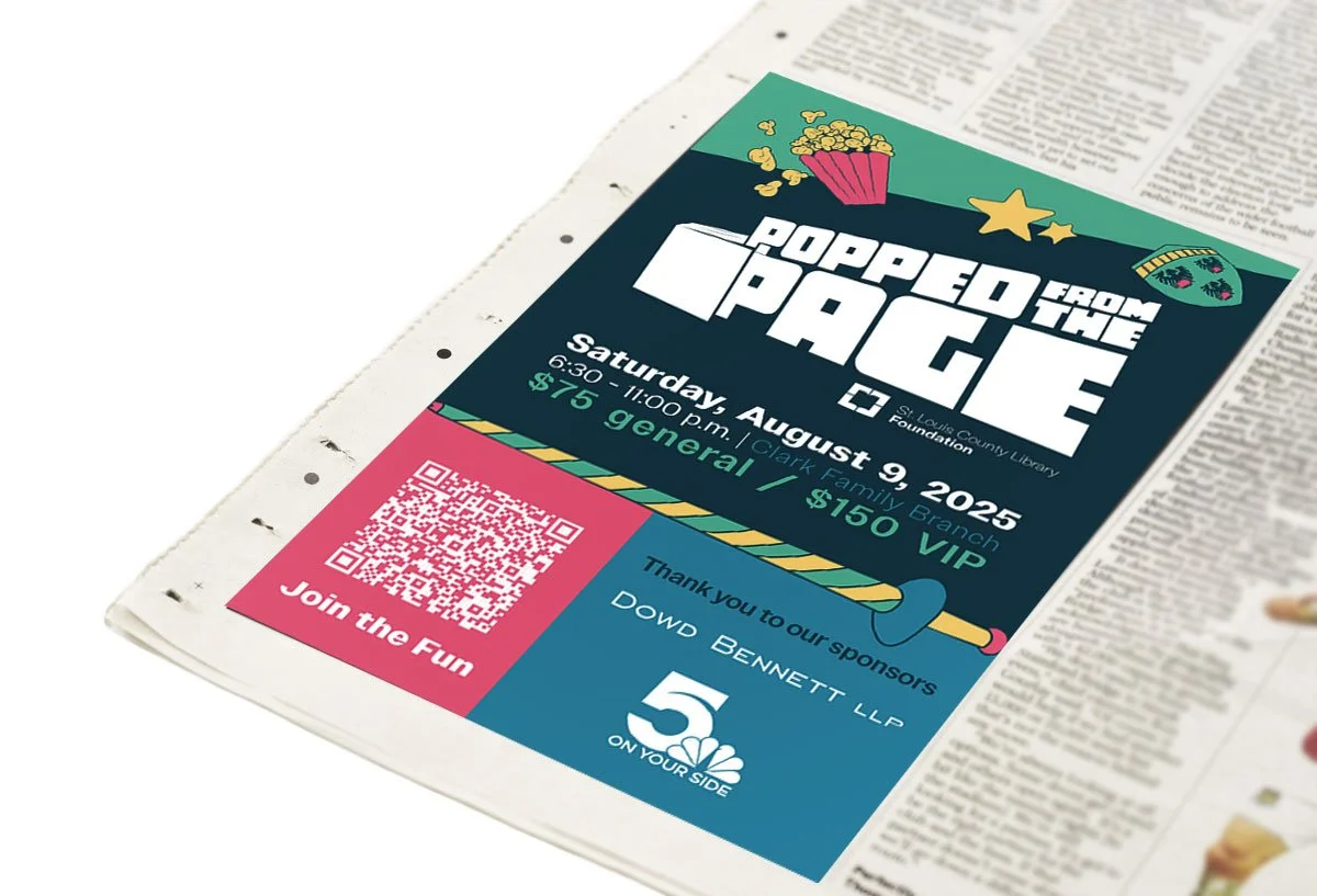
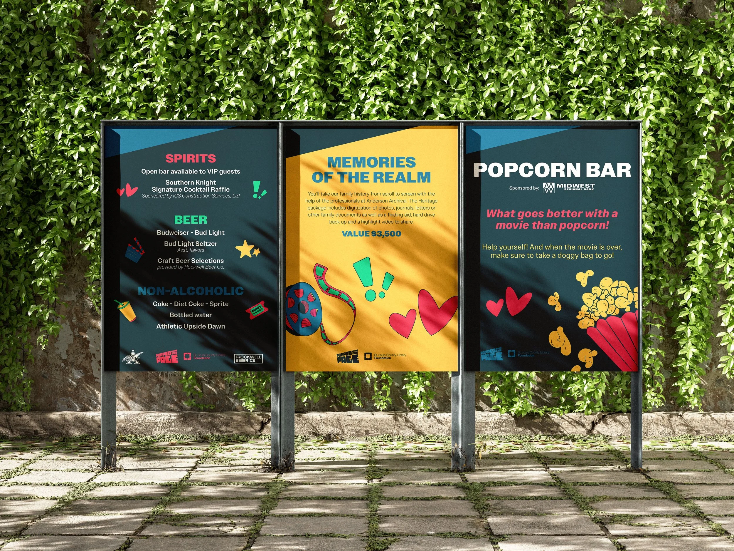
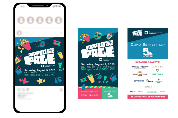
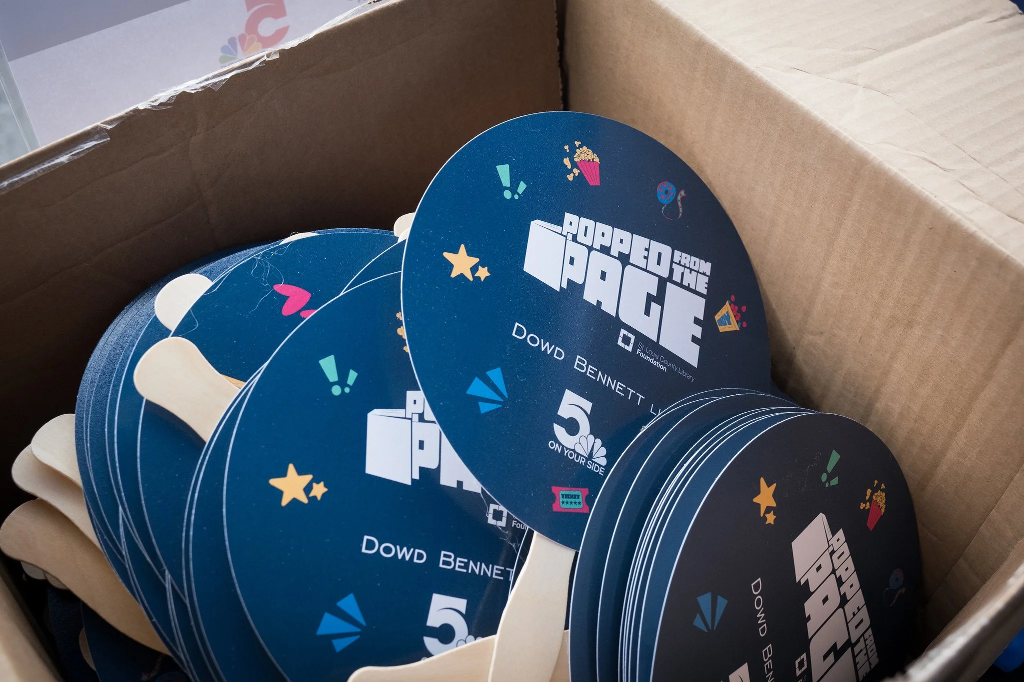
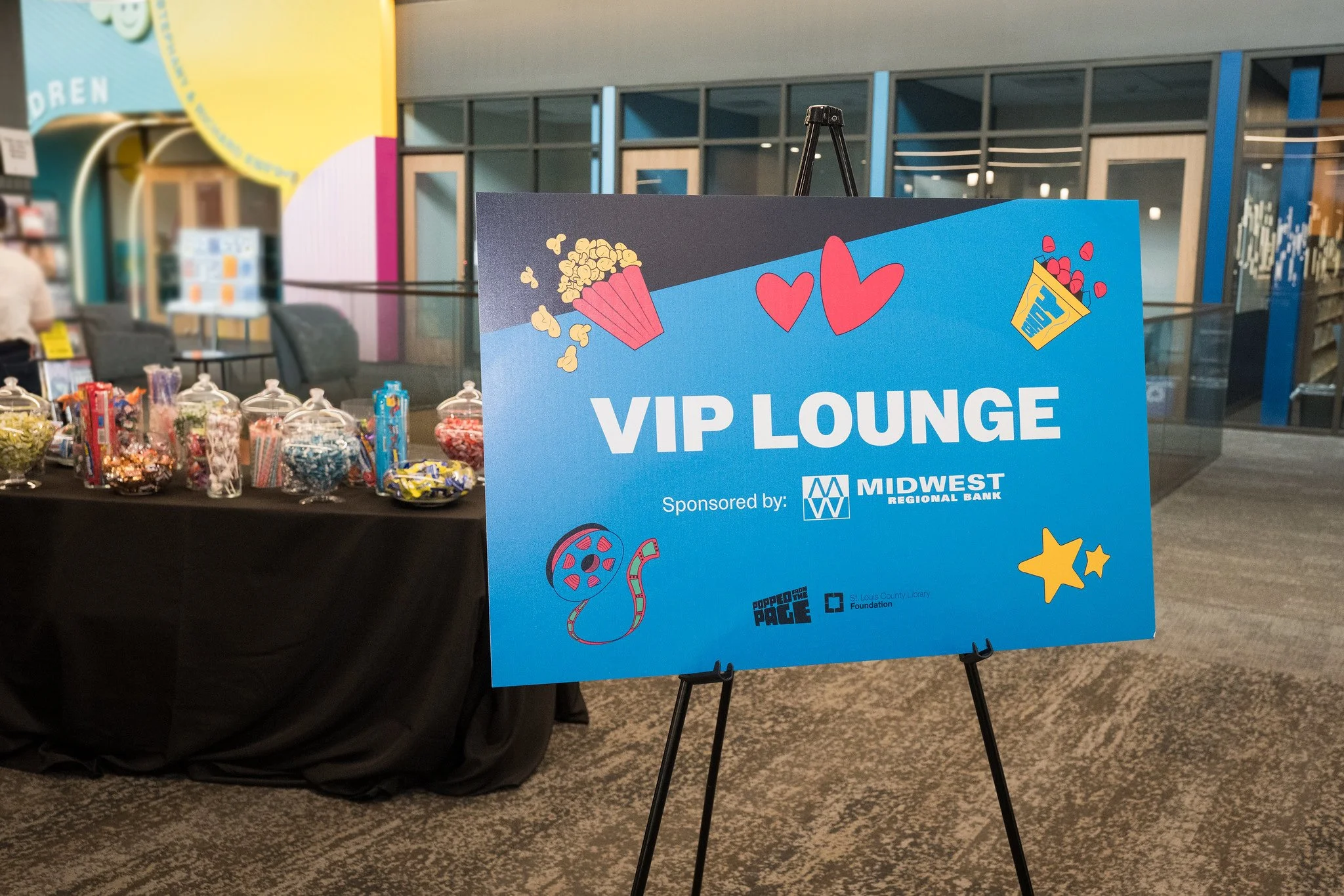
I was approached by the St. Louis County Library Foundation with a branding project for their event, Popped from the Page. This event was a fundraiser that was meant to attract a younger demographic than their usual clientele. With that in mind, I created a brand that was fun, colorful, and full of whimsical personality.
Brand in the wild

Attribution: St. Louis County Library, Lucas Peterson
Attribution: St. Louis County Library, Lucas Peterson

Attribution: St. Louis County Library, Lucas Peterson
Attribution: St. Louis County Library, Lucas Peterson

Attribution: St. Louis County Library, Lucas Peterson
Attribution: St. Louis County Library, Lucas Peterson
Attribution: St. Louis County Library, Lucas Peterson
Logo and Brand System Exploration
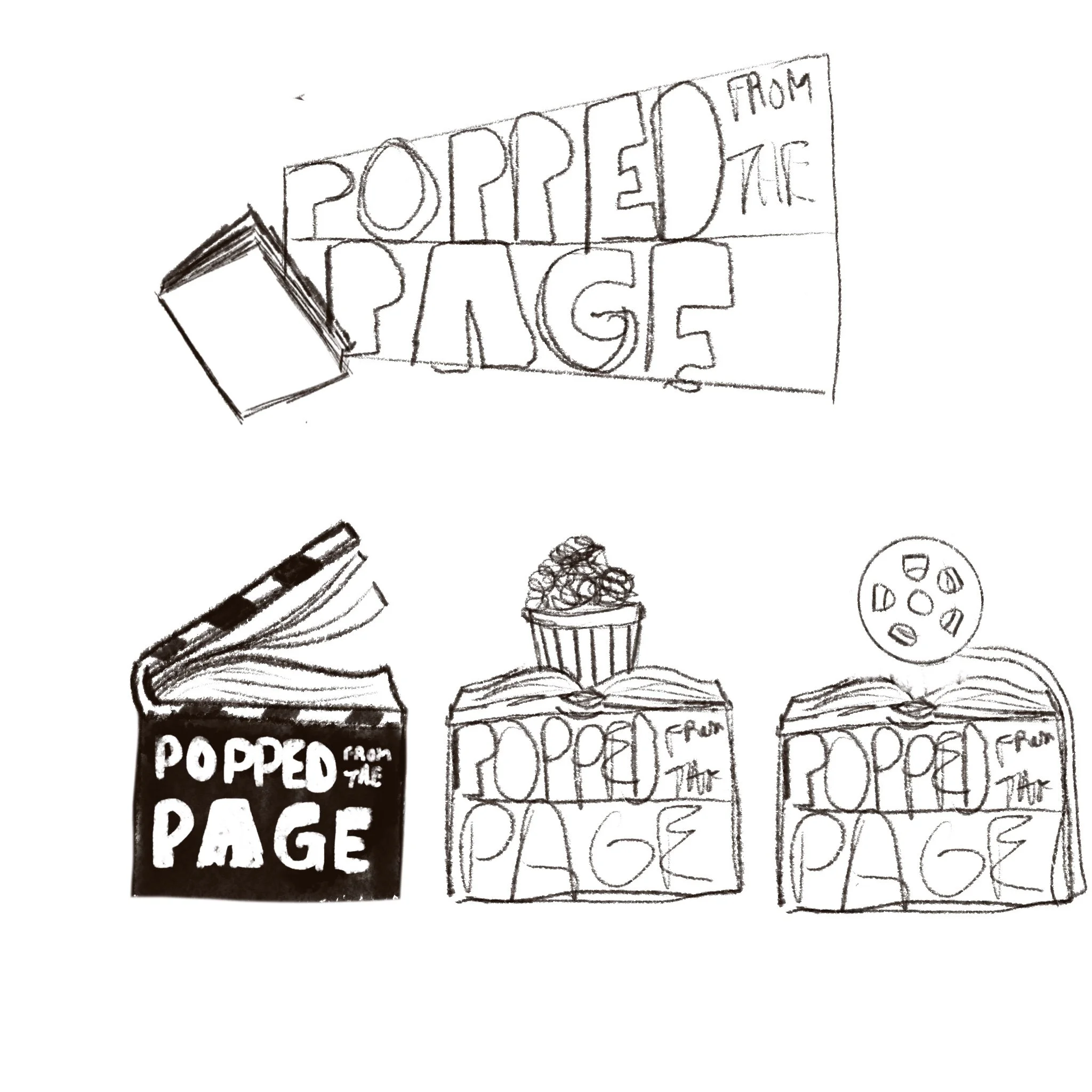
First concepts and sketches for the logo. This is a movie event based on books, so including elements from both was requested.
The second round of concepts introduced the look with a single color and started to explore typography while cleaning up the sketches from the first round of concepts.
The chosen logo was one that was versatile and bold. It's shape taken from a spotlight from a movie projector, with the words "popping" from the book to the left hand side. For smaller applications, the book is removed to maintain legibility, keeping the unique shape but allowing for the STCLF logo to be visible at the smaller scale.
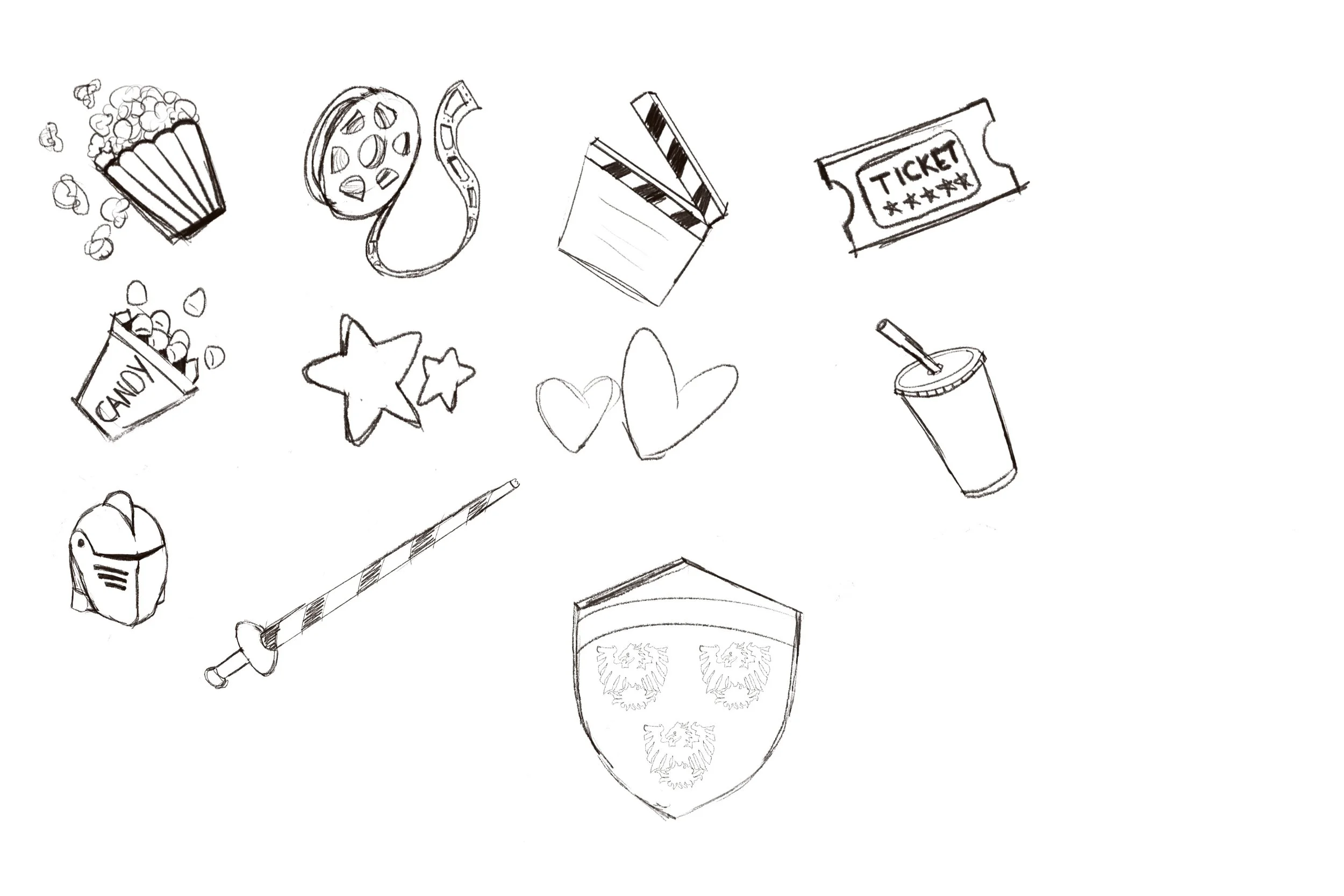
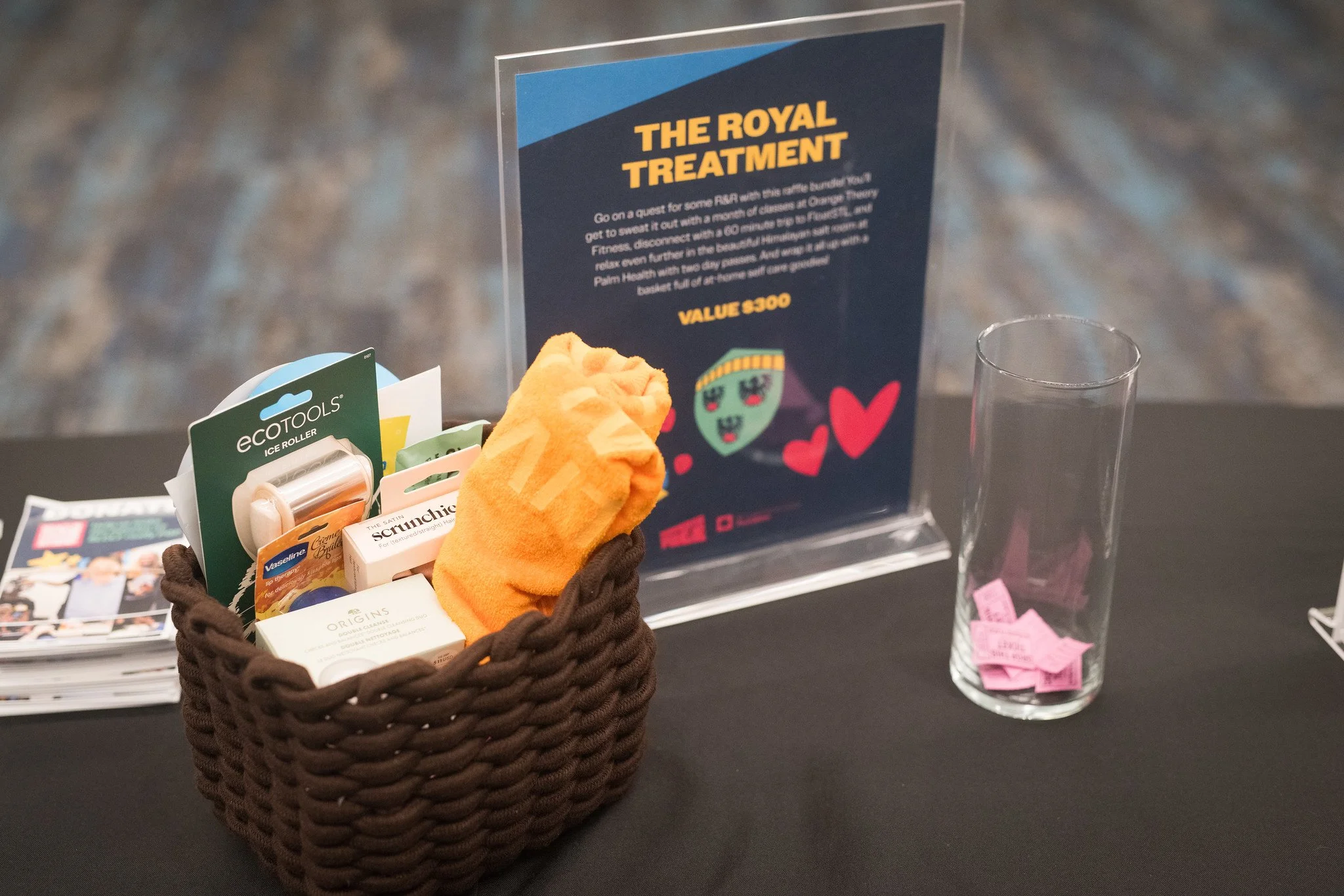
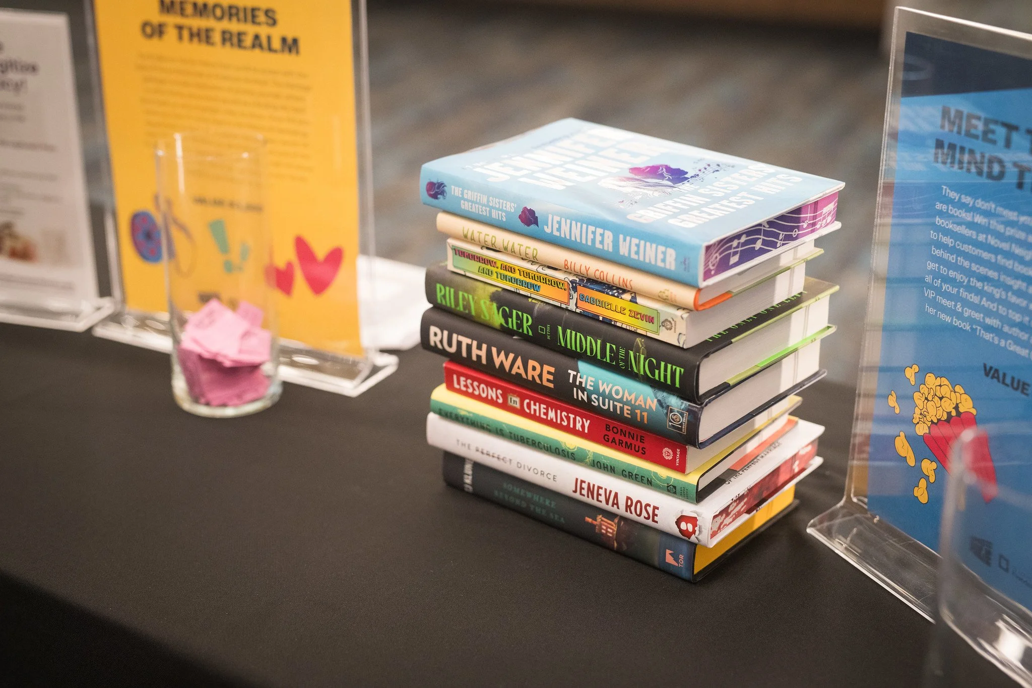
Adding original illustrations to the brand helped it to feel feel vibrant, fun, and overall cohesive with the event and younger demographic (21+).

